
AtlasXomics Data Analysis Package
Unlock the Spatial Dimension of Your Data
Data Analysis
From raw data to pathology-guided insight — in one workspace
Process spatial epigenomics data, annotate clusters, integrate tissue pathology, and choose the analysis path that fits your team — DIY outputs for in-house pipelines or expert reporting in a secure cloud workspace.
Workflow in the AtlasXomics portal
Explore your data
Load sequencing and imaging files, review QC, and generate outputs ready for downstream analysis and collaboration.
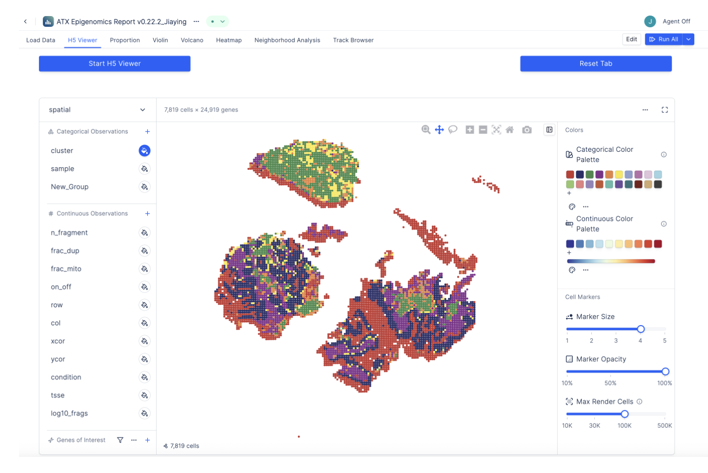
- Standard processing + QC review
- Spot-level metrics and filters
- Exports for downstream analysis
Annotate your clusters
Use gene activity and accessibility to label clusters, compare populations, and map cell states spatially.
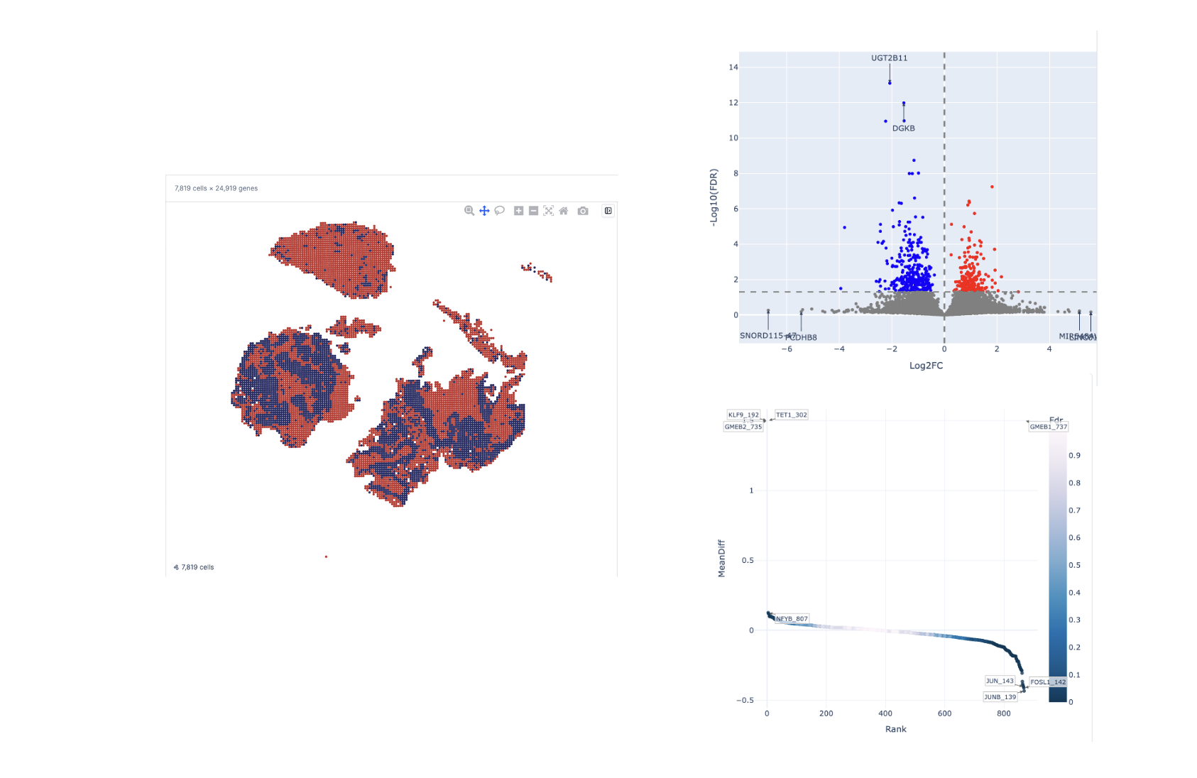
- Cluster annotation via gene activity
- Side-by-side population comparisons
- Motif and accessibility analysis
Integrate tissue pathology
Align annotated H&E with spatial maps, select regions directly on tissue, and run pathology-guided comparisons.

- Overlay H&E and spatial features
- ROI-based spatial comparisons
- Link morphology to regulation
Choose your analysis path
DIY outputs for your pipeline, or expert reporting from AtlasXomics.
DIY Data Analysis
Full control for experienced analysts
- Processed outputs delivered directly to you
- Built around open-source packages (e.g., Seurat and ArchR)
- Analyze locally or within your own infrastructure
- Ideal for teams with in-house bioinformatics expertise
AtlasXomics Cloud Solution
Data analysis without coding
- End-to-end cloud workflows from FASTQs to interactive visualization
- Built-in quality control, filtering, and clustering optimization
- Automated peak calling, motif enrichment, and differential analysis
- Spatial visualization through an interactive app
- Advanced downstream spatial analyses